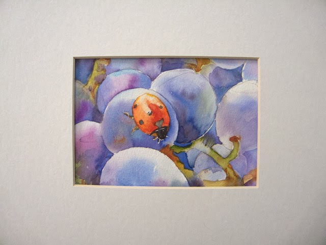
Finished. Have to stop pecking at this; the top left is looking overworked to me ... I may crop it more tightly. And I think I'll try it again ... starting with a light wash and glazing.
I've taken two workshops with Mel Stabin and he noticed how I often fail to paint to edge, as on the right here. I don't know why I do that--just sloppy, I guess. One teacher of mine suggested lightly drawing a frame within which to paint, which is a good idea.
So, which do you prefer, the full-size or the cropped version?


10 comments:
Gosh Laura,
I usually have strong opinions about such things but honestly i like them both! Beautiful work! Hugs! deb
I have one idea about this that you don´t paint all the way out to the edge; I think that it is not neccesary to paint all the way out, the problem is more of that the edge is too sharp when not being painted all the way out. Couldn´t you instead wet the sides of the paper ,so that the paint floats and become thinner and softer there insted. I have noticed myself doing the same as you, and I got the idea just now when reading about you doing it too! And I don´t think it looks too much in the top left. It looks good! Take care!
it's something I tend to do as well, not painting to the edge, and I also tend to sometimes fade things out as Catharina has suggested. I've also tried lightly drawing in a frame using a mount that I intend on putting the finished painting in. I quite like the effect of not being painted to the edge sometimes though and dont think it's always necessary - both the full version and the cropped look great - beautiful washes
Cropped!
I agree with the two comments above about letting the painting fade out - but that actually requires a bit of foreplanning. If this is something you like to do, then just figure you will "vignette" your paintings, but plan on someplace where you stop intentionally to allow the paint to fade out.
I think the bug looks a bit pasted on, and wonder if you could put a bit of dark on the bottom edge of his(her?)lower wing, or slightly darken just under that, it might make the bug stand up a bit from the grape.
I do like your work - so soft and very "watercolor-y".
Although I didn't even notice any issues about the bug on first glance, I think she's probably right that he (she?) might cast a wee bit of a shadow, and that might ground her.
Meanwhile, I think this is beautiful. Although I DO like the tight crop best for overall composition, I didn't notice that the upper left looked overworked.
Well, I like both of them. I do love the luscious colors in the grapes and then the little surprise of color in the ladybug. I like the idea of just washing out the colors into the edges if you don't want to deal with them - and the edges would need to be washed out with a bit of color or cropped if the white edge is too hard so our eyes don't go there.
What a lot of very good observations and advice: thank you all!
I'll have to ask for your help more often.
I think I prefer the uncropped version. The slightly unfinished portion at the right doesn't bother me in the slightest, and I like the ladybug looking smaller in the large landscape of the grapes. I love the play of the ladybug and its reddish orange against the violet fruit.
Hmmm, I like it cropped too. It has to be your call. What makes you happier? Put it away for a few days and then look at it again with fresh eyes.
Cropped. But then, that is always my preference. Don't you hate though when you work so hard on a painting and then end up cropping a lot of it off in order to "save" it? Methinks we could all do with some more pre-planning. It's not the fun part of painting, but it does help to do a value sketch first. Maybe your larger version could be helped by some value adjustments to lead the eye through the piece. I would try that before cropping. Put a piece of clear acetate over the painting and apply some colors to "try them out."
I LOVE THIS!!! The ladybug is fantastic!
Post a Comment