Wednesday, June 29, 2011

my little backdrop

 
(7x11)
I was always reluctant to paint my black cat, Smilla--too many nuances in that black ... until it occurred to me: forget the nuance, just make a shape. She's turned out to be the perfect backdrop for florals! 

 
(11x15)
Smilla's next assignment: backdrop for white roses.


(4x6)
Inspired by Cynthia of Galerie46's all-yellow palette, I've decided to begin making a study of yellow. I'm very comfortable with the red-violet to blue-green spectrum, but not so much with yellow, which I always think of as "difficult." But yellow is so important: when you choose the right one, on its own or to mix, it's so gorgeous; choose the wrong one ... yuck. I am going to make a concerted effort to learn my yellows. 
And, for my New Mexico trip in October, I bought Daniel Smith's quinacridone set, which, with a couple of additions (mixes made with quinacridones), I'm going to put in two of Cheap Joe's "piggyback" palettes, one for me, and one for Robin, so we can play around with them.
Posted by Picasa

Tuesday, June 28, 2011

gestural florals workshop, day two

(7x11)
The second day we made our own little setups.
The day flew by!

(7x11, unfinished)

(11x15)

(11x15, unfinished)

In the comments on yesterday's post, OnTheRoad asked if I found the palette of colors I brought to the workshop worked for me ... Yes, on the whole, but I found myself wishing for a more transparent orange and regretted the Daniel Smith apatite genuine, which I substituted for sap green but which seemed grayer and more opaque. Quinacridone magenta and aureolin yellow were indispensable. Also, it turns out indanthrene blue is no substitute for Antwerp, which is a beautifully transparent blue that makes lovely fresh greens.

Monday, June 27, 2011

floral gestures workshop, day one

(5x7)
I'm back from a wonderful two-day workshop with Jackie Saunders.
When we walked into the studio there were buckets and buckets of fresh flowers: Jackie very sensibly had us start by spending the morning painting individual flowers, looking at their shapes and colors. The peonies were gorgeous, but I especially enjoyed the snapdragons--I wound up painting all types of flowers I would never think of even trying to paint and learned that an arrangement needn't be beautiful or perfect to produce a good painting.
 (11x15 sheet)


(5x7)
I experienced a little exasperation with my Fabriano hot press paper, which was much too "soft" and didn't really allow me to do much adjusting or moving of the paint once I'd put it down. (The next day I used a piece of Shelby's Arches hot press, which was much better.)
In the afternoon we made small arrangements. Jackie emphasized that we should move from one flower to another making connections, allowing the colors to fuse. Her demonstrations were inspiring and really made everyone paint enthusiastically!
Jackie also teaches life drawing and I really hope to take a life class with her sometime.


(7x11)


Friday, June 24, 2011

unexpected

 
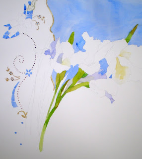
White gladiolas are blooming in my yard: I have no recollection of planting them, but was happy to see them.
I made a backdrop from two cloths I picked up at the secondhand store: I'm always looking for lace or cut-out patterns that are not too complex for me to paint.
This is on about a 16x20 sheet of paper. I had intended to include the jar (below), but now I'm not sure ... It's still unfinished so I may change my mind.


(detail)


I'm on my way to DC to paint flowers with my friends for two days: bliss!
Have a wonderful weekend!
Posted by Picasa

Thursday, June 23, 2011

hydrangeas and peonies

 
(10x14)


(9x12)
I should have titled this post "Things I Can't Grow." They're two of my favorites (actually, it seems whatever's in bloom is my favorite: love the one you're with) but my hydrangeas always wilt and my peonies never bloom.

Friday I'm heading down to DC for a two-day florals workshop ... I'll finish these peonies when I get back!
Posted by Picasa

Wednesday, June 22, 2011

francisco de asis

 
(8x10)
A statue of St Francis of Assisi in front of a restaurant in Chimayo, New Mexico.
I took a picture of this bronze statue when I was in NM four years ago and I think it may have been made by Marco Oviedo, who is one of the owners of the inn where Robin and I will be staying when we go in October.
I'll have to have another go at it ... I should have stopped last night after the second glass of wine.
I started college as an art history major. The Rogier van der Weyden Crucifixion in the Philadelphia Museum of Art first got me interested in the Northern Renaissance, which was to be my specialty. I'm not a believer, but found myself drawn to iconography, which is a kind of language, and to the lives of the saints, a kind of biography ... So I guess it's not surprising I wound up an English major instead.
I made a little watercolor journal to bring to NM and wanted something characteristic for the cover ... it was either pinons, ristras, or vigas: I went for the simplest!

Feliz cumpleaƱos, Petirrojo, amiga de toda mi vida ... y mucho mas!

Posted by Picasa

Tuesday, June 21, 2011

"it's a beautiful ride"

 
(7x10)
"It's a beautiful ride" is the slogan of the Cape May - Lewes ferry, and it's true.
I've been accumulating a number of unfinished paintings and decided to try to "finish" this one. I like this subject but there are two, for me, insurmountable mistakes here: I cannot get the glasses right, and the more I try the worse it gets (something a watercolorist should know!) and I regret making the railing so prominent; I have tried to subdue it, in vain.
I do like the nose and lips and will try this one again and see if I learn from my mistakes!
Posted by Picasa

Monday, June 20, 2011

expedius tempus


(10x14)
Found myself with no company and without any (paying) work to do (I could have worked in the yard) ... and with these already-cut lilies: so I made the most of it and spent part of the afternoon painting.
Also spent more time playing around with my palettes: it's such fun. I've had this Winsor & Newton set for more than twenty years, I think  (and good thing since it costs a small fortune now). It's such an ingenious little device--I have the same admiration for its design that I do for boat cabins, which always are so well-thought-out, a place for everything. Every time I attend a boat show I wish I had been a boat designer.
But, I haven't used this kit, which still had the original colors it came with, much of late. To make more use of it, I updated the selection of 12 colors it holds. And then realized I could squeeze in two more using glue dots--cadmium red light and cobalt violet. I had to forgo burnt sienna, which I actually use a lot, but figure I can mix a reasonable approximation of. Or I hope I can.

And here, for Father's Day (and, in the tradition of my father, a day late ...), a picture of my dad from 1975 standing in front of the house he built: he cleared the lot, designed the house, laid the foundation, did the framing, electric, plumbing, the roof ... My brothers and I helped with the drywall on weekends, and we'd sleep on lawn chairs in the house, which had no windows or doors. We got breakfast from Dunkin Donuts and built fires in the front yard and cooked hot dogs on sticks we picked up in the woods for dinner. Coming from NYC, we thought we were the Swiss Family Robinson. If the house is ever torn down, they'll find drawings of the Beatles on the back sides of the wallboard.
This is how I always picture Dad in my mind; he was 43. At 79, though, with pure white hair and well-trimmed Vandyke, he's still a handsome devil.

Posted by Picasa

Sunday, June 19, 2011

smilla saves the day

 
(10x14)
I was on my third go round of trying to paint these very delicately pink lilies when my cat, Smilla, left her customary spot in the hammock to obligingly provide a nice contrast (she's watching the bird bath--I need to find a much bigger bell for her collar). I have a bit more to do to bring out the lettering on the Ball jar.
I painted this on a just-opened block of Arches hot press, and even though this was the third sheet in, I found it annoyingly absorbent; it was a struggle to get the paint to flow on the surface.


Mineke Reinders and I had a discussion not too long ago about the best way to respond to the comments our Kind Readers leave for us. Long ago I stopped responding in my own comments section and instead would respond on the commenter's blog if the comment seemed to call for a response. As you know, sometimes it all gets so time-consuming and yet reciprocity is the heart of blogging. I've decided to adapt the policy of the Painter's Loft, where when you post a picture you are asked to comment on one. Whenever I post I will commit myself to comment on 5 other blogs, those on my blog roll or those I find in others' blog rolls, which is always a great way to be introduced to new artists. (I could browse blogs all day, really, but I have to work--I get paid by the hour!)
Also, in the past, if someone asked me a question in their comment, I would email them an answer. I think, in future, I will answer any questions in my next post, in case the answer may be of interest to others.
That's the plan ... for now.
Posted by Picasa

Saturday, June 18, 2011

upcoming workshop


Next weekend I'll be in Washington DC with my friends Shelby and Lori to take a two-day "gestural florals" workshop with Jackie Saunders at the Torpedo Factory.
Today I put together this palette with the colors she recommends and a couple I can't do without, cobalt violet and ultramarine violet. I always make a little diagram of the colors to tape to the lid:
These are a few additional colors that I think I may want (the little tubs sold for the Possum Palette are perfect for colors that won't fit on your palette; the snap-on lids keep most paints moist indefinitely):

And I'm out of Antwerp blue, which Jackie recommended, so I tried out these dark blues looking for a substitute and decided on the W&N indanthene blue (on the far left).


Now to try out my new palette on some pale pink lilies.

Posted by Picasa

Wednesday, June 15, 2011

WsIP

 
(detail)


 There are a lot of white lilies in bloom in my yard right now and I couldn't live with myself if I didn't try to paint them! I decided to use the pattern from a pair of capri pants for the background (yes, I love to wear flowered pants). First I drew the lilies in lead pencil; then I realized I'd be very confused if I also drew the fabric pattern in pencil and drew it instead with an ochre watercolor pencil ... I still got confused, but not so much!
In my house everything is blue--blue and white, blue and beige, blue and brown--but I really like the black-white-green color scheme here.

And, below, I began to try out a photo I took at the Ocean City Arts Center--a little girl waiting for her music lesson. This WIP, I think, points up the problems inherent in taking not-so-good photos: without a strong source of light, even though the subject appeals to me so much, I feel adrift. I should do it again after rethinking and re-creating the light.
Posted by Picasa

Monday, June 13, 2011

playing with food

 
(5x6)
A little (as-much-as-I-can-manage) unself-conscious playing with paint: shapes, colors ... not overthinking.

 
(4x6)


(9x12)
Posted by Picasa

Sunday, June 12, 2011

little practice

 
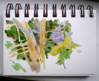
(3x5 Strathmore journal)
A view from a window in Pennsylvania. These evergreens, with branches that grow straight out from the trunk, break up the space nicely.

 
(3x5 handmade journal)

I'm going to be practicing with my little travel kit more in preparation for a return visit to New Mexico in October. Four years ago I met my friend Shelby in Jan Hart's workshop; this fall we're going back, and my bff from high school who just started watercolor painting, Robin, will be coming too!
Robin and I plan to stay in Chimayo, a center of weaving, and to stay for a few days after the workshop to visit pueblos and hike Ghost Ranch. Finally taking a trip together. Next year: Victoria, BC?


Posted by Picasa