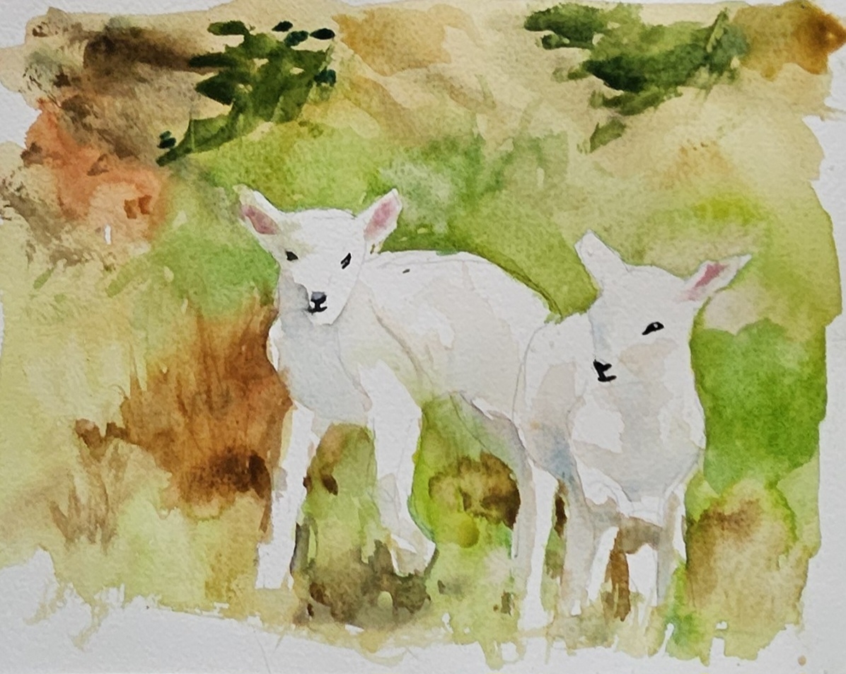
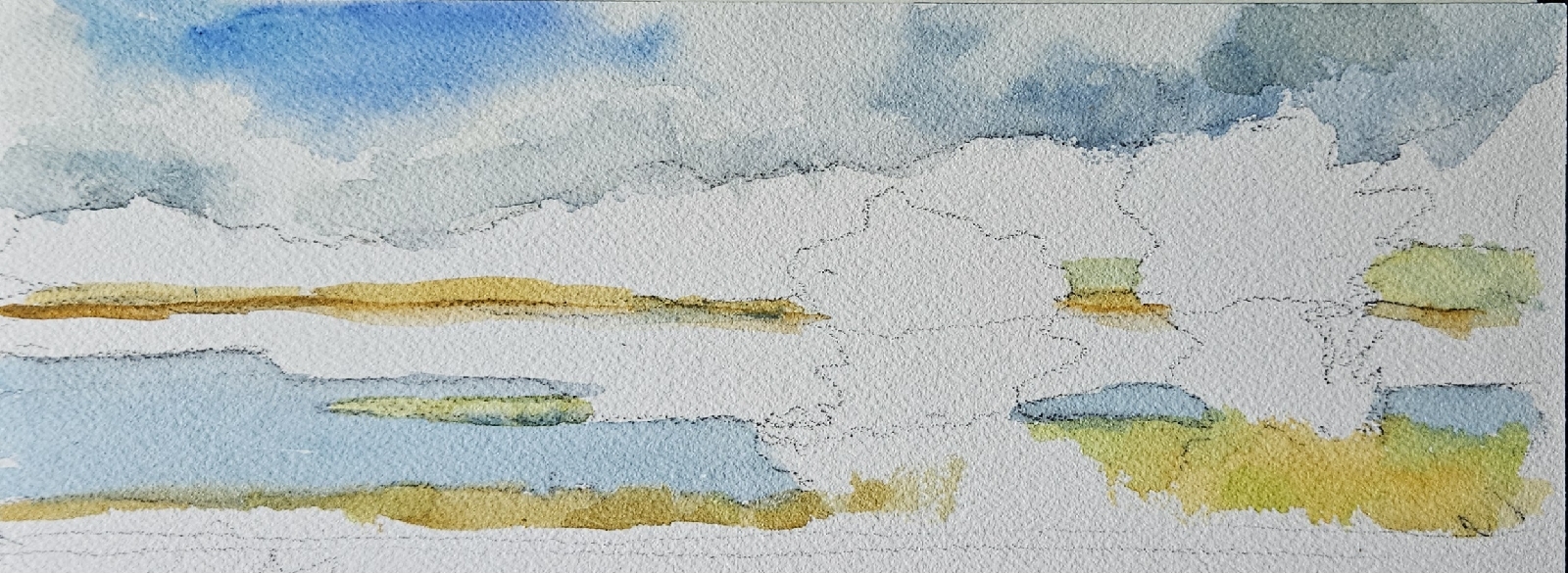
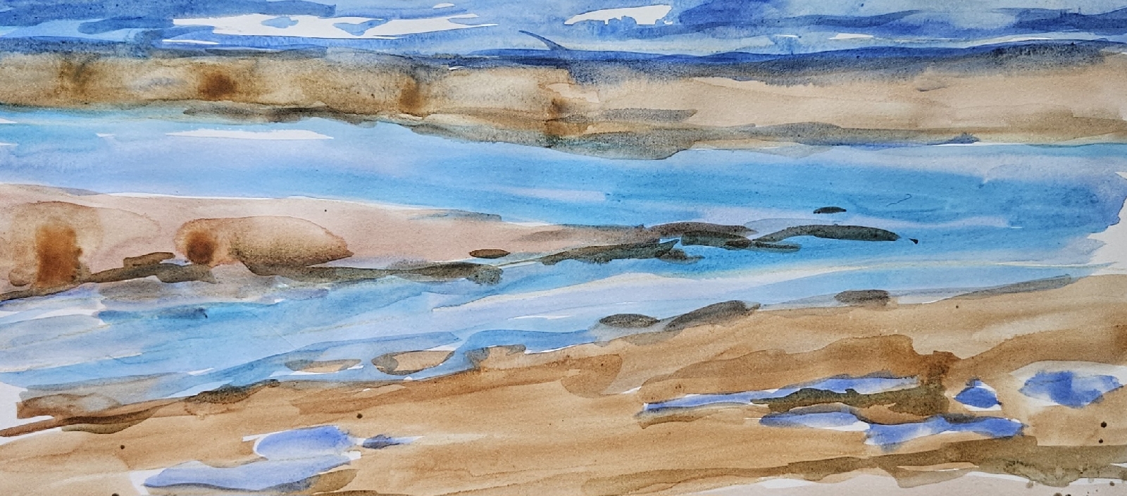
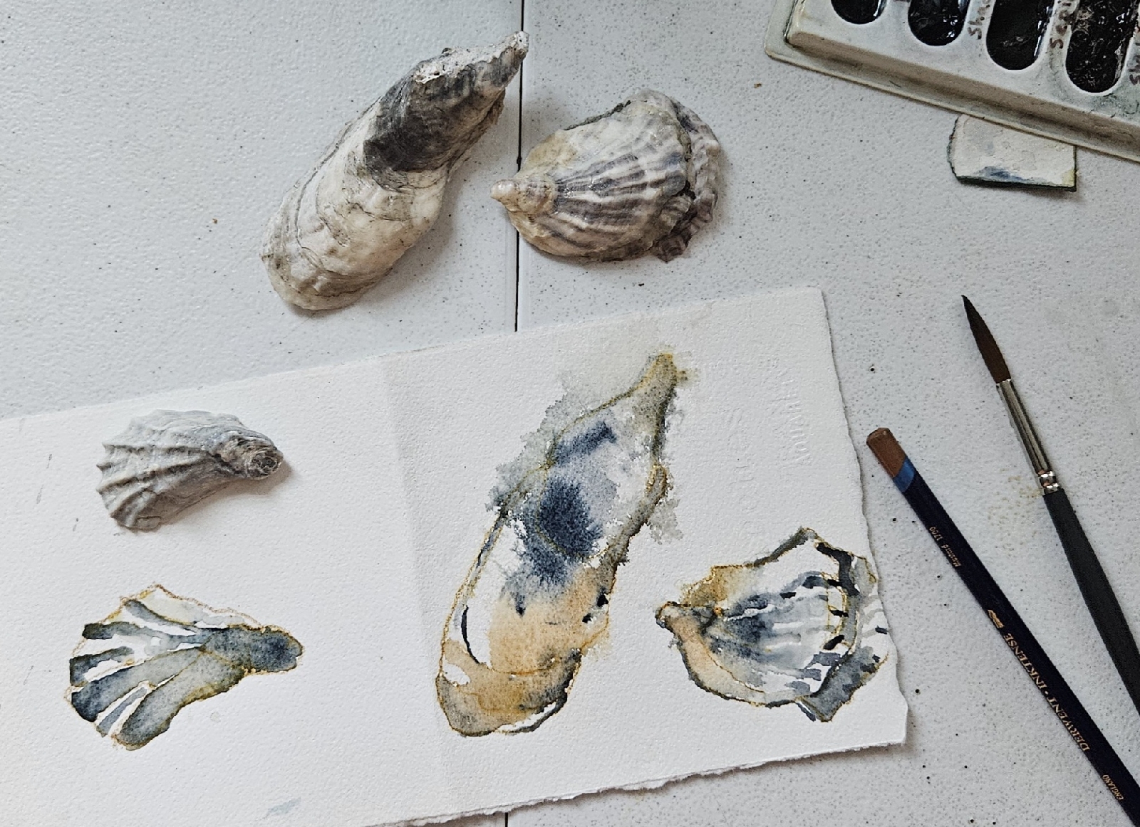
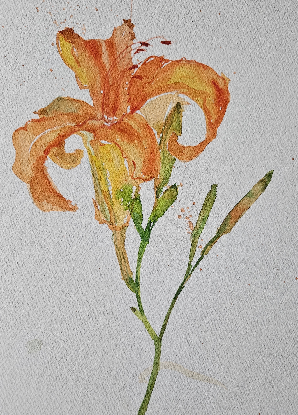
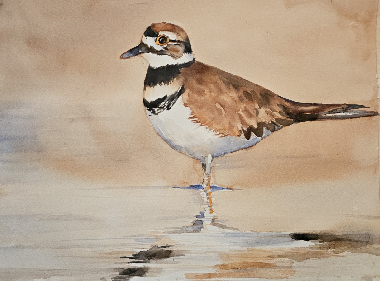
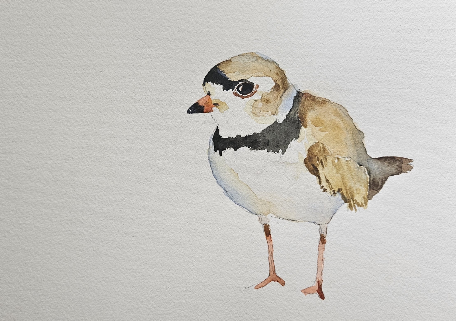
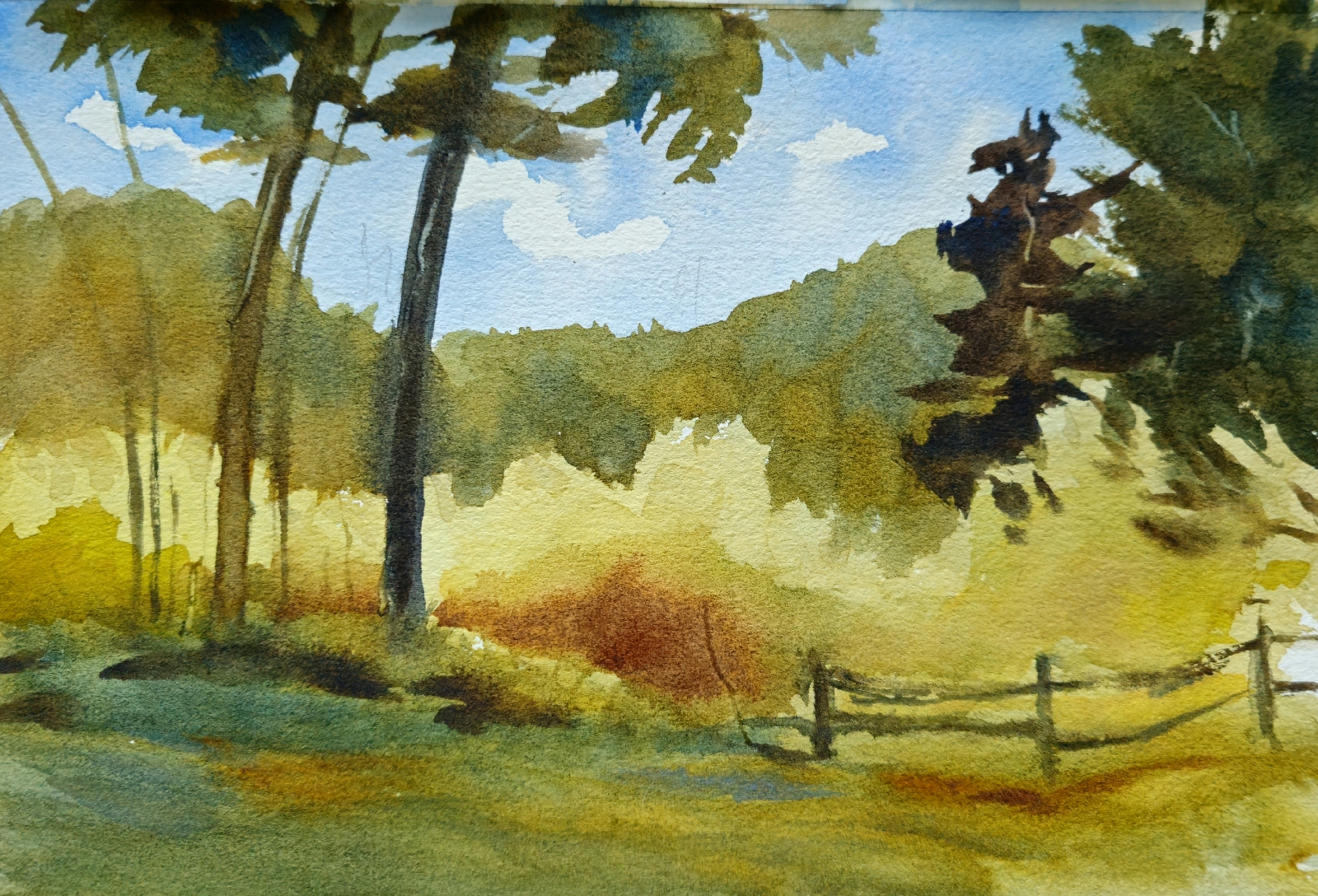
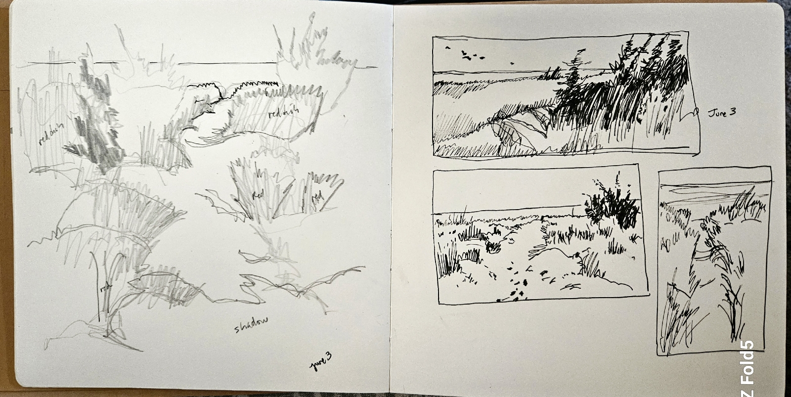
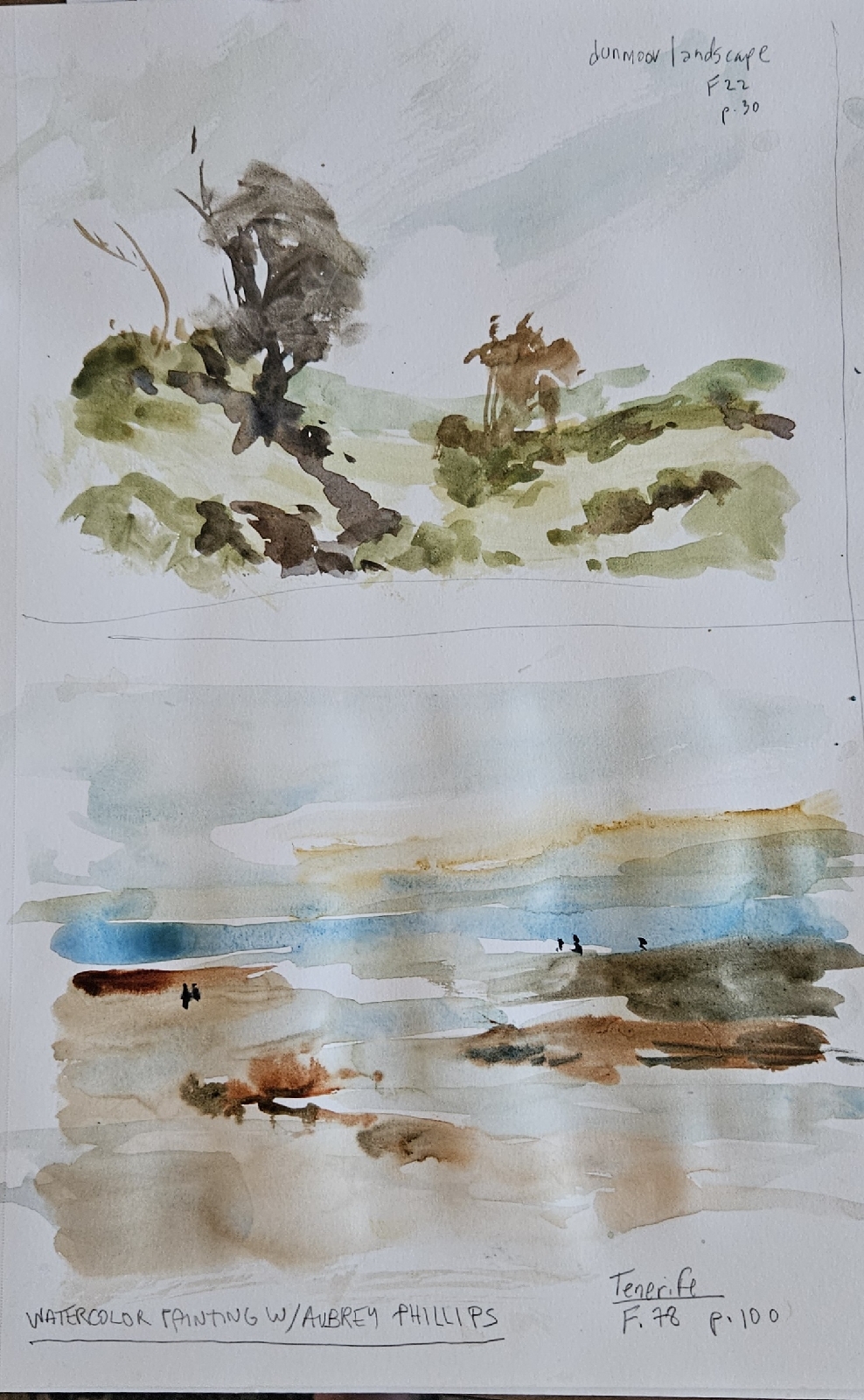
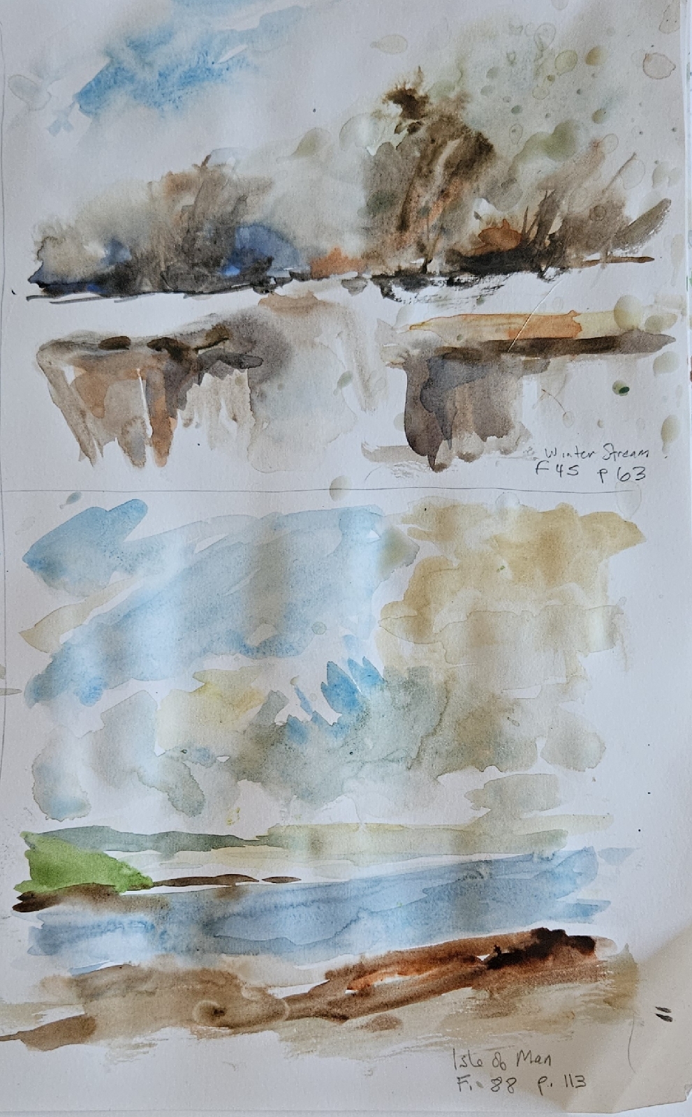
laura's watercolors
Wednesday, May 22, 2013
Tuesday, May 21, 2013
wip: hammock time
A friend's granddaughter ... I've been wanting to paint this photo for some time: the light, the mood. So summer afternoon. So tween.
Finally started and messed it up right off by painting the legs too dark and too blue. I guess I could try to lift or glaze ... But I think instead I'll think of this as practice and begin again.
Maybe with some cropping I can salvage a bit ...
Finally started and messed it up right off by painting the legs too dark and too blue. I guess I could try to lift or glaze ... But I think instead I'll think of this as practice and begin again.
Maybe with some cropping I can salvage a bit ...
(9x12-ish)
Sunday, May 19, 2013
Saturday, May 18, 2013
(re)visiting
Friday, May 17, 2013
the hangover
Thursday, May 16, 2013
good intentions ...
My veterinarian's birthday was last week, so I wanted to paint a little birthday card for him ... I thought it would be easy, but it ended in frustration. No good deed goes unpunished!
I did finally do one that I figured would have to do and sent it off before I could second-guess myself ... or photograph it.
Speaking of unrewarded good deeds: I have to apologize for not getting around to respond to comments left on the blog this past week; after the workshop, I have been spending nearly all my time trying to catch up on all the (paying) work I should have been doing while I was out painting.
Next: catch up on blog-hopping.
Monday, May 13, 2013
Mel Stabin workshop: last day
From one of Mel's fabulous reference photos. I just loved this woman's face. I have to lift some from the eye that's in shadow (it's too dark) and work on her left shoulder/clavicle area a bit (and I should've softened the v of her shawl) ... There are problems, but I like face, especially the lips.
Mel's demonstration--he painted one of the workshoppers--was a revelation. He did a big, loose, wet wash ... then somehow pulled, with the minimum of strokes possible, details from it. In the case of the painting above, after his demo, I realized what I had to concentrate on not losing was the light on the cheek and nose... and I think those highlights really make it.
Below: based on a reference from Paint My Photo. The face is not like the girl's in the photo's, but I like my girl's expression: she looks determined.
I don't usually paint people, but every time I do, I want to do more; faces are just endlessly fascinating.
Sunday, May 12, 2013
Mel Stabin workshop: midweek
(11x15)
One thing Mel emphasizes is connecting shapes--surprisingly difficult to do; for me, it involves totally changing the way I see things: not easy--turning three shapes into two shapes, two shapes into one shape, with one wash, as much as possible, and altering the color as you go. Mel also advocates making the most of the midtones; he prefers, I think, a sensitive rendering of the full range of midtones to contrasty light/dark compositions. That's what I was trying for here; and achieved to some degree ... though it's a bit too hard-edged everywhere for me (and probably for Mel).
The lighthouse painting, I think, has a nice combination of hard and soft edges, but the color is too intense throughout ... it would probably benefit from some more subtle neutrals.
Saturday, May 11, 2013
Mel Stabin workshop: first days (and my palette colors)
One morning after his demo, Mel sent us out to make sketches that we would then paint from. So these are the two I managed before walking to the bakery for some pre-lunch danishes.
The painting below is from the first day. The reference photo always appealed to me, but I'll have to get a lot faster and more confident with my washes to pull it off.
This was my second Mel Stabin workshop in two years. Mel's a great teacher and critiquer and about the sweetest guy imaginable.
He said there are three important things in a painting, in order of importance:
1. Shape
2. Value
3. Color, which is very subjective
Jane asked me yesterday what colors are on my palette. These are the colors that are always on my palette:
aureolin, Indian yellow or new gamboge, cadmium yellow; cadmium red, carmine; cerulean, cobalt, and ultramarine blue; green-gold, sap green and Hooker's green; raw sienna (I think Winsor & Newton is the brightest and most transparent), quinacridone burnt orange, burnt sienna.
I like to have a couple of oranges and the ones I seem to have settled on are Winsor orange and Schmincke's transparent orange.
In the pink-purple range, I have: permanent rose (or quinacridone rose, always!), cobalt violet (which differs a lot from one manufacturer to another, and is sometimes additionally labeled "light" or "dark"--I prefer the light; my current favorite is Winsor & Newton (PV 14) or Sennelier (PV122) in the tube, but I wouldn't recommend buying this color in the pan; in my experience it's usually too hard and oily and doesn't soften up), Holbein bright violet (BV 7.15), quinacridone magenta, quinacridone pink, and a dark blue-violet (dioxazine, usually, but Maimeri Blu's blue violet is beautiful). Opera pink too, which is quite bright for a nice punch but also mixes well.
I'll also add more blues, like manganese--I like it's brightness and transparency--and, a current favorite, indanthrone, or Antwerp for a dark blue. I usually have cobalt teal and thalo turquoise, though I don't seem to use them much.
Friday, May 10, 2013
apple blossom
(5x7)
Yesterday was the last day of the Mel Stabin workshop, which really fun and enlightening. I hope I can apply some of Mel's ideas ... but for today, it's back to work; I have a lot to catch up on.
Over the weekend I'll post paintings form the workshop and some of the things Mel said.
Wednesday, May 08, 2013
final daffodils '13
Monday, May 06, 2013
Sunday, May 05, 2013
tulip
Saturday, May 04, 2013
lemons and white jug again
(9x12)
Wanted to have another go at the jug, to try to get the ellipse at the mouth right ... "Try" being the operative word.
Also painted on a pre-colored ground, this time intentionally, but somehow it just doesn't have the glow of the first (below). Maybe because, overall, it's cooler; also, the edges of the pitcher are harder, less lost.
Friday, May 03, 2013
"milk"
(11x15)
I like this jug, the lettering, which is not so long or complicated as to be a chore, and the little jughandles.
I regret that dark, flat shadow in the bottom one. Tried lifting, but no luck. Maybe I'll darken the background (the background: another cause for regret!) behind it, couldn't hurt.
Subscribe to:
Posts (Atom)


