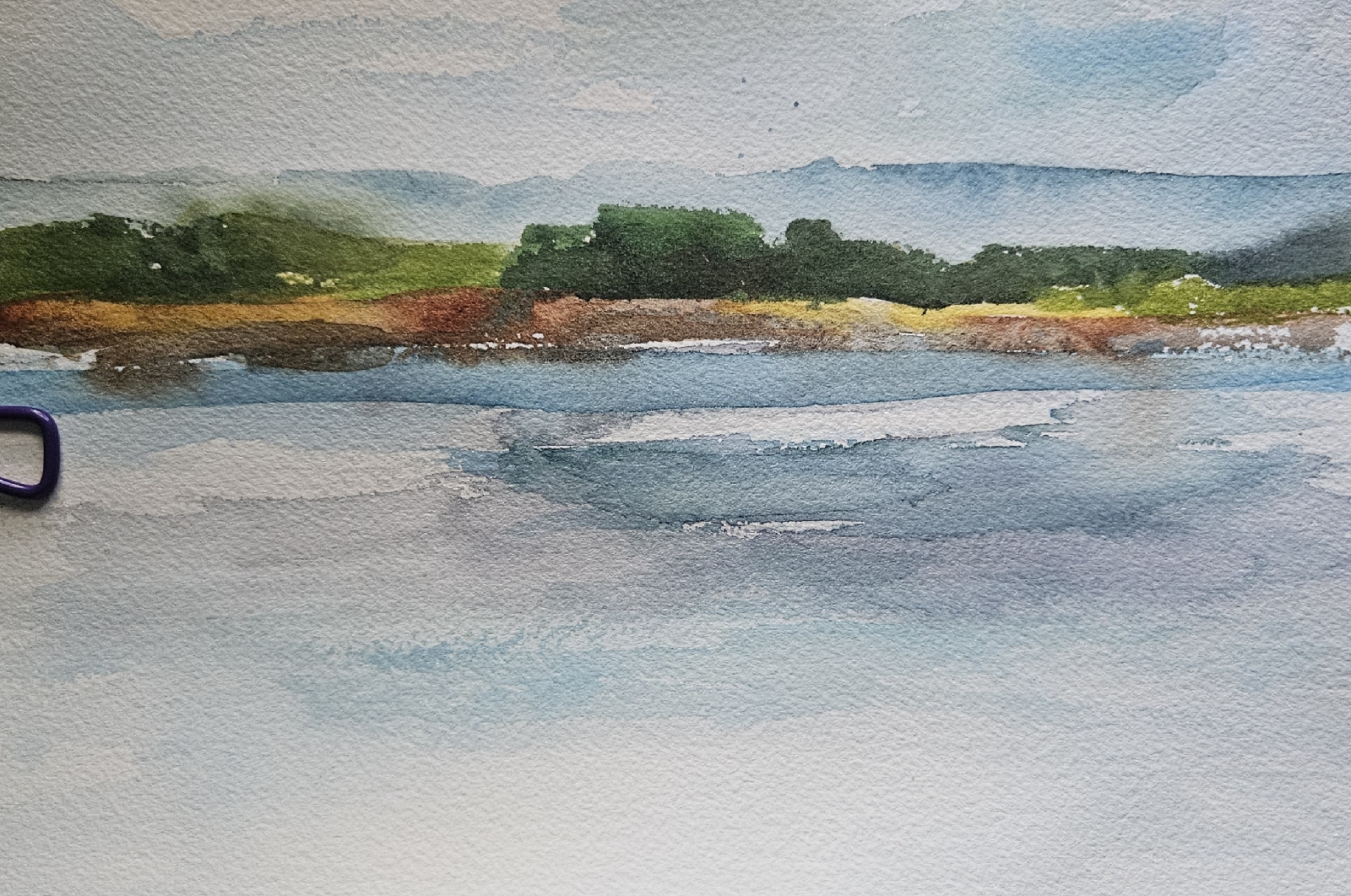
10x14
A landscape painted in class with SaltyWaterArt last night.
And below are the four sketches we did first; mine are 7x10 and presented in order, 1-4.
The idea was to get more abstract in each version. But as you see. I couldn't do it.
I think the relentless horizontality of the subject stymied me. That's my excuse anyway.
Nonetheless, I think this is great way to proceed.


2 comments:
You did get looser in each iteration but nothing wrong with not getting more abstract when you can create things like these. It’s so hard to stop comparing ourselves to others and seeing how we come up short when, just maybe, we are showing our true colors and style and that’s great!
That is so true, Rhonda! Thank you for the (needed) reminder!
Post a Comment