
(Congress Hall, 5x7)

(The Carroll Villa, 5x7)
One morning after his demo, Mel sent us out to make sketches that we would then paint from. So these are the two I managed before walking to the bakery for some pre-lunch danishes.
The painting below is from the first day. The reference photo always appealed to me, but I'll have to get a lot faster and more confident with my washes to pull it off.

(11x15)
This was my second Mel Stabin workshop in two years. Mel's a great teacher and critiquer and about the sweetest guy imaginable.
He said there are three important things in a painting, in order of importance:
1. Shape
2. Value
3. Color, which is very subjective
Jane asked me yesterday what colors are on my palette. These are the colors that are always on my palette:
aureolin, Indian yellow or new gamboge, cadmium yellow; cadmium red, carmine; cerulean, cobalt, and ultramarine blue; green-gold, sap green and Hooker's green; raw sienna (I think Winsor & Newton is the brightest and most transparent), quinacridone burnt orange, burnt sienna.
I like to have a couple of oranges and the ones I seem to have settled on are Winsor orange and Schmincke's transparent orange.
In the pink-purple range, I have: permanent rose (or quinacridone rose, always!), cobalt violet (which differs a lot from one manufacturer to another, and is sometimes additionally labeled "light" or "dark"--I prefer the light; my current favorite is Winsor & Newton (PV 14) or Sennelier (PV122) in the tube, but I wouldn't recommend buying this color in the pan; in my experience it's usually too hard and oily and doesn't soften up), Holbein bright violet (BV 7.15), quinacridone magenta, quinacridone pink, and a dark blue-violet (dioxazine, usually, but Maimeri Blu's blue violet is beautiful). Opera pink too, which is quite bright for a nice punch but also mixes well.
I'll also add more blues, like manganese--I like it's brightness and transparency--and, a current favorite, indanthrone, or Antwerp for a dark blue. I usually have cobalt teal and thalo turquoise, though I don't seem to use them much.

 (11x14)

 (11x15)

 (7x11)
 (11x15)

 (7x11)
 (7x11)
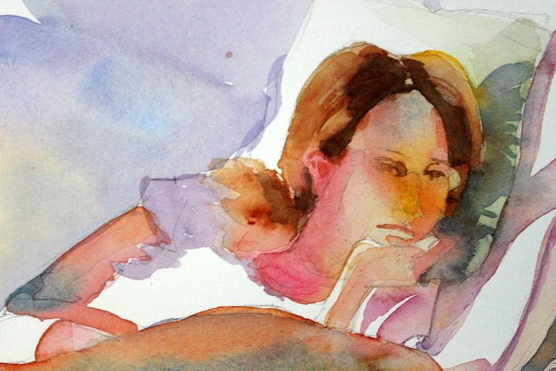


 (5x7)
(5x7) (5x7)
(5x7) (4x6) 2nd try
 (4x6) 1st try
 (15x30)


 (11x15)
 (Congress Hall, 5x7)
 (The Carroll Villa, 5x7)
 (11x15)

 (7x11)


